01-定位(重点)
作用:灵活的改变盒子在网页中的位置
实现:
1.定位模式:position
2.边偏移:设置盒子的位置
相对定位
position: relative
特点:
- 不脱标,占用自己原来位置
- 显示模式特点保持不变
- 设置边偏移则相对自己原来位置移动
1
2
3
4
5
| div {
position: relative;
top: 100px;
left: 200px;
}
|
绝对定位
position: absolute
使用场景:子级绝对定位,父级相对定位(子绝父相)
特点:
- 脱标,不占位
- 显示模式具备行内块特点
- 设置边偏移则相对最近的已经定位的祖先(可以是相对,也可以是绝对)元素改变位置
- 如果祖先元素都未定位,则相对浏览器可视区改变位置
1
2
3
4
5
6
7
8
9
| .father {
position: relative;
}
.father span {
position: absolute;
top: 0;
right: 0;
}
|
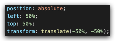
定位居中
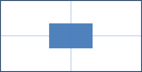
实现步骤:
- 绝对定位
- 水平、垂直边偏移为 50%
- 子级向左、上移动自身尺寸的一半
- 左、上的外边距为 –尺寸的一半
- transform: translate(-50%, -50%)
1
2
3
4
5
6
7
8
9
10
11
12
13
14
15
16
17
18
19
20
21
22
23
24
25
26
27
28
29
30
31
32
33
34
35
36
37
38
39
40
41
42
43
44
45
| <!DOCTYPE html>
<html lang="en">
<head>
<meta charset="UTF-8">
<meta http-equiv="X-UA-Compatible" content="IE=edge">
<meta name="viewport" content="width=device-width, initial-scale=1.0">
<title>Document</title>
<style>
.box {
position: absolute;
left: 50%;
top: 50%;
transform: translate(-50%, -50%);
width: 200px;
height: 200px;
background-color: pink;
}
img {
position: absolute;
top: 50%;
left: 50%;
transform: translate(-50%, -50%);
}
</style>
</head>
<body>
<!-- <div class="box"></div> -->
<img src="./images/down-open.png" alt="">
</body>
</html>
|
固定定位
position: fixed
场景:元素的位置在网页滚动时不会改变
特点:
- 脱标,不占位
- 显示模式具备行内块特点
- 设置边偏移相对浏览器窗口改变位置
1
2
3
4
5
6
7
8
9
10
11
12
13
14
15
16
17
18
19
20
21
22
23
24
25
26
27
28
29
30
31
| <!DOCTYPE html>
<html lang="en">
<head>
<meta charset="UTF-8">
<meta http-equiv="X-UA-Compatible" content="IE=edge">
<meta name="viewport" content="width=device-width, initial-scale=1.0">
<title>Document</title>
<style>
.header {
position: fixed;
left: 0;
top: 0;
width: 100%;
height: 80px;
background-color: pink;
}
</style>
</head>
<body>
<div class="header">123</div>
<p> 里面有很多的文字</p>
<p> 里面有很多的文字</p>
<p> 里面有很多的文字</p>
<p> 里面有很多的文字</p>
<p> 里面有很多的文字</p>
</body>
</html>
|
堆叠层级z-index

默认效果:按照标签书写顺序,后来者居上
作用:设置定位元素的层级顺序,改变定位元素的显示顺序
属性名:z-index
属性值:整数数字(默认值为auto,取值越大,层级越高)
1
2
3
4
5
6
7
8
9
10
11
12
13
14
15
16
17
18
19
20
21
22
23
24
25
26
27
28
29
30
31
32
33
34
35
36
37
38
39
40
41
42
43
44
45
46
47
48
49
| <!DOCTYPE html>
<html lang="en">
<head>
<meta charset="UTF-8">
<meta http-equiv="X-UA-Compatible" content="IE=edge">
<meta name="viewport" content="width=device-width, initial-scale=1.0">
<title>Document</title>
<style>
div {
position: absolute;
top: 0;
left: 0;
width: 200px;
height: 200px;
}
.box1 {
background-color: red;
z-index: 1;
}
.box2 {
background-color: green;
left: 20px;
top: 20px;
z-index: 2;
}
.box3 {
background-color: blue;
left: 40px;
top: 40px;
}
</style>
</head>
<body>
<div class="box1"></div>
<div class="box2"></div>
<div class="box3"></div>
</body>
</html>
|
粘性定位
粘性定位可以被认为是相对定位和固定定位的混合,元素在跨越特定阀值前为相对定位,之后则是绝对定位
注意:必须指定top、right、bottom、left四个值其中之一
02-高级技巧
CSS精灵
CSS 精灵,也叫 CSS Sprites,是一种网页图片应用处理方式。把网页中一些背景图片整合到一张图片文件中,再background-position 精确的定位出背景图片的位置。
优点:减少服务器被请求次数,减轻服务器的压力,提高页面加载速度
实现步骤:
- 创建盒子,盒子尺寸与小图尺寸相同
- 设置盒子背景图为精灵图
- 添加 background-position 属性,改变背景图位置
3.1 使用 PxCook 测量小图片左上角坐标
3.2 取负数坐标为 background-position 属性值(向左上移动图片位置)
案例-写出自己的名字
HTML结构
1
2
3
4
5
6
7
8
9
10
11
12
13
14
15
16
17
18
19
20
21
22
23
24
25
26
27
28
29
30
31
32
33
34
35
36
37
38
39
40
41
42
43
44
45
46
47
48
49
50
51
52
53
54
55
56
57
58
59
60
61
| <!DOCTYPE html>
<html lang="en">
<head>
<meta charset="UTF-8">
<meta http-equiv="X-UA-Compatible" content="IE=edge">
<meta name="viewport" content="width=device-width, initial-scale=1.0">
<title>Document</title>
<style>
div {
display: inline-block;
margin: 0 15px;
background: url(./images/abcd.jpg) no-repeat;
}
.l {
width: 96px;
height: 112px;
background-color: pink;
background-position: -5px -275px;
}
.i {
width: 62px;
height: 107px;
background-position: -324px -141px;
}
.u {
width: 112px;
height: 112px;
background-position: -476px -421px;
}
span {
display: block;
width: 106px;
height: 118px;
background: url(./images/abcd.jpg) no-repeat;
transition: .2s;
}
span:hover {
background-position: -484px -10px;
}
</style>
</head>
<body>
<div class="l"></div>
<div class="i"></div>
<div class="u"></div>
<span></span>
</body>
</html>
|
字体图标(重点)
字体图标:展示的是图标,本质是字体
作用:在网页中添加简单的、颜色单一的小图标
优点
- 灵活性:灵活地修改样式,例如:尺寸、颜色等
- 轻量级:体积小、渲染快、降低服务器请求次数
- 兼容性:几乎兼容所有主流浏览器
- 使用方便:先下载再使用
下载字体
iconfont 图标库:https://www.iconfont.cn/
登录 → 素材库 → 官方图标库 → 进入图标库 → 选图标,加入购物车 → 购物车,添加至项目,确定 → 下载至本地
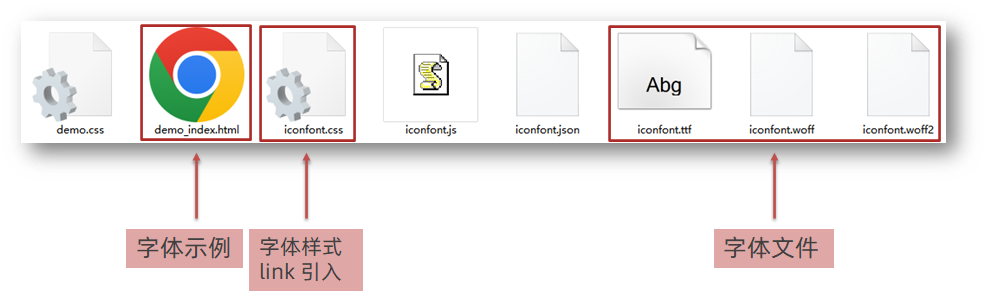
使用字体
引入字体样式表(iconfont.css)
标签使用字体图标类名
- iconfont:字体图标基本样式(字体名,字体大小等等)
- icon-xxx:图标对应的类名

1
2
3
4
5
6
7
8
9
10
11
12
13
14
15
16
17
18
19
20
21
22
23
24
25
| <!DOCTYPE html>
<html lang="en">
<head>
<meta charset="UTF-8">
<meta http-equiv="X-UA-Compatible" content="IE=edge">
<meta name="viewport" content="width=device-width, initial-scale=1.0">
<title>Document</title>
<link rel="stylesheet" href="./fonts/iconfont.css">
<style>
.iconfont {
font-size: 300px;
color: pink;
}
</style>
</head>
<body>
<i class="iconfont icon-shouji"></i>
<span class="iconfont icon-zhaoxiangji"></span>
</body>
</html>
|
03-CSS修饰属性
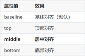
垂直对齐方式
属性名:vertical-align
1
2
3
4
5
6
7
8
9
10
11
12
13
14
15
16
17
18
19
20
21
22
23
24
25
26
27
28
29
30
31
32
33
34
35
36
37
38
39
40
41
42
| <!DOCTYPE html>
<html lang="en">
<head>
<meta charset="UTF-8">
<meta http-equiv="X-UA-Compatible" content="IE=edge">
<meta name="viewport" content="width=device-width, initial-scale=1.0">
<title>Document</title>
<style>
img {
vertical-align: middle;
}
span {
display: inline-block;
vertical-align: middle;
width: 50px;
height: 50px;
background-color: pink;
}
div {
border: 2px solid red;
}
</style>
</head>
<body>
<img src="./images/computer.png" alt=""> my name is 刘德华
<span></span> my name is 刘德华
<hr>
<div>
<img src="./images/1.webp" alt="">
</div>
</body>
</html>
|
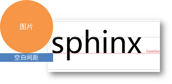
去除图片底部缝隙的两种方法:
- 给图片添加 display: block;
- 给图片添加 vertical-align: middle; 等,只要不是 baseline就行
过渡
作用:可以为一个元素在不同状态之间切换的时候添加过渡效果
属性名:transition(复合属性)
属性值:过渡的属性 花费时间 (s)
提示:
- 过渡的属性可以是具体的 CSS 属性
- 也可以为 all(两个状态属性值不同的所有属性,都产生过渡效果)
- transition 设置给元素本身
1
2
3
4
5
6
7
8
9
10
11
12
13
14
15
16
17
18
19
20
21
22
23
24
25
26
27
28
29
30
31
32
33
34
35
36
37
38
39
40
41
42
43
44
45
| <!DOCTYPE html>
<html lang="en">
<head>
<meta charset="UTF-8">
<meta http-equiv="X-UA-Compatible" content="IE=edge">
<meta name="viewport" content="width=device-width, initial-scale=1.0">
<title>Document</title>
<style>
.box {
width: 200px;
height: 200px;
background-color: pink;
transition: all .3s;
}
.box:hover {
height: 300px;
width: 300px;
background-color: green;
}
input {
width: 200px;
height: 30px;
transition: all .3s;
}
input:focus {
width: 300px;
background-color: pink;
}
</style>
</head>
<body>
<div class="box"></div>
<input type="text">
</body>
</html>
|
表单获得焦点选择器 focus
1
2
3
4
5
|
input:focus {
width: 300px;
background-color: pink;
}
|
透明度opacity
作用:设置整个元素的透明度(包含背景和内容)
属性名:opacity
属性值:0 – 1
- 0:完全透明(元素不可见)
- 1:不透明
- 0-1之间小数:半透明
1
2
3
4
5
6
7
8
9
10
11
12
13
14
15
16
17
18
19
20
21
22
23
24
25
26
27
28
29
30
31
32
33
34
35
36
37
38
39
40
41
42
43
| <!DOCTYPE html>
<html lang="en">
<head>
<meta charset="UTF-8">
<meta http-equiv="X-UA-Compatible" content="IE=edge">
<meta name="viewport" content="width=device-width, initial-scale=1.0">
<title>Document</title>
<style>
body {
background: url(./images/huawei.jpg);
}
.box1 {
width: 200px;
height: 200px;
background-color: pink;
opacity: 0.2;
}
.box2 {
width: 200px;
height: 200px;
background-color: rgba(0, 0, 0, 0.3);
color: #fff;
}
</style>
</head>
<body>
<div class="box1">
里面的文字也会半透明
</div>
<div class="box2">
里面的文字不半透明
</div>
</body>
</html>
|
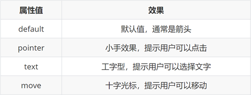
光标类型cursor
作用:鼠标悬停在元素上时指针显示样式
属性名:cursor
1
2
3
4
5
6
7
8
9
10
11
12
13
14
15
16
17
18
19
20
21
22
23
24
25
26
27
28
29
30
31
32
33
34
35
36
37
38
39
40
41
42
43
44
45
46
47
48
49
50
51
| <!DOCTYPE html>
<html lang="en">
<head>
<meta charset="UTF-8">
<meta http-equiv="X-UA-Compatible" content="IE=edge">
<meta name="viewport" content="width=device-width, initial-scale=1.0">
<title>Document</title>
<style>
div:nth-child(1) {
cursor: default;
}
div:nth-child(2) {
cursor: pointer;
}
div:nth-child(3) {
cursor: text;
}
div:nth-child(4) {
cursor: move;
}
div:nth-child(5) {
cursor: not-allowed;
}
button {
cursor: pointer;
}
</style>
</head>
<body>
<div>鼠标默认</div>
<div>鼠标小手</div>
<div>鼠标选择文本</div>
<div>鼠标移动</div>
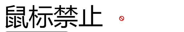
<div>鼠标禁止</div>
<button>注册</button>
</body>
</html>
|
禁用鼠标样式
1
2
3
4
| div:nth-child(5) {
cursor: not-allowed;
}
|
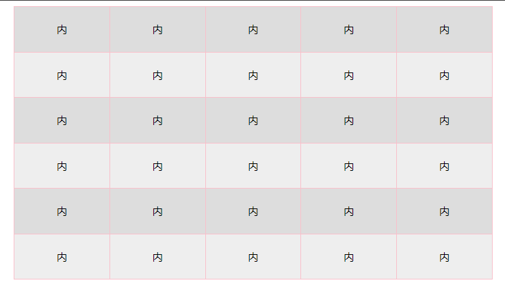
表格样式-合并相邻两个边框
1
2
3
4
5
6
7
8
9
10
11
12
13
14
15
16
17
18
19
20
21
22
23
24
25
26
27
28
29
30
31
32
33
34
35
36
37
38
39
40
41
42
43
44
45
46
47
48
49
50
51
52
53
54
55
56
57
58
59
60
61
62
63
64
65
66
67
68
69
70
71
72
73
74
75
76
77
78
79
80
81
82
83
84
85
86
87
| <!DOCTYPE html>
<html lang="en">
<head>
<meta charset="UTF-8">
<meta http-equiv="X-UA-Compatible" content="IE=edge">
<meta name="viewport" content="width=device-width, initial-scale=1.0">
<title>Document</title>
<style>
table {
width: 700px;
height: 400px;
margin: 0 auto;
text-align: center;
}
table,
tr,
td {
border: 1px solid pink;
border-collapse: collapse;
}
tr:nth-child(even) {
background-color: #eee;
}
tr:nth-child(odd) {
background-color: #ddd;
}
</style>
</head>
<body>
<table>
<tr>
<td>内</td>
<td>内</td>
<td>内</td>
<td>内</td>
<td>内</td>
</tr>
<tr>
<td>内</td>
<td>内</td>
<td>内</td>
<td>内</td>
<td>内</td>
</tr>
<tr>
<td>内</td>
<td>内</td>
<td>内</td>
<td>内</td>
<td>内</td>
</tr>
<tr>
<td>内</td>
<td>内</td>
<td>内</td>
<td>内</td>
<td>内</td>
</tr>
<tr>
<td>内</td>
<td>内</td>
<td>内</td>
<td>内</td>
<td>内</td>
</tr>
<tr>
<td>内</td>
<td>内</td>
<td>内</td>
<td>内</td>
<td>内</td>
</tr>
</table>
</body>
</html>
|
04-平面转换
简介
作用:为元素添加动态效果,一般与过渡配合使用
概念:改变盒子在平面内的形态(位移、旋转、缩放、倾斜)
平面转换也叫 2D 转换,属性是 transform
平移
1
| transform: translate(X轴移动距离, Y轴移动距离);
|
- 取值
- 像素单位数值
- 百分比(参照盒子自身尺寸计算结果)
- 正负均可
- 技巧
- translate() 只写一个值,表示沿着 X 轴移动
- 单独设置 X 或 Y 轴移动距离:translateX() 或 translateY()
定位居中
旋转
1
| transform: rotate(旋转角度);
|
- 取值:角度单位是 deg
- 技巧
- 取值正负均可
- 取值为正,顺时针旋转
- 取值为负,逆时针旋转
转换原点
默认情况下,转换原点是盒子中心点
1
| transform-origin: 水平原点位置 垂直原点位置;
|
取值:
- 方位名词(left、top、right、bottom、center)
- 像素单位数值
- 百分比
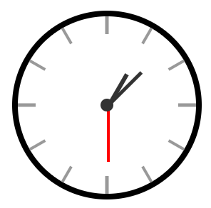
案例-时钟
1
2
3
4
5
6
7
8
9
10
11
12
13
14
15
16
17
18
19
20
21
22
23
24
25
26
| .hour {
width: 6px;
height: 50px;
background-color: #333;
margin-left: -3px;
transform: rotate(15deg);
transform-origin: center bottom;
}
.minute {
width: 5px;
height: 65px;
background-color: #333;
margin-left: -3px;
transform: rotate(90deg);
transform-origin: center bottom;
}
.second {
width: 4px;
height: 80px;
background-color: red;
margin-left: -2px;
transform: rotate(240deg);
transform-origin: center bottom;
}
|
多重转换
多重转换技巧:先平移再旋转
1
| transform: translate() rotate();
|
- 多重转换原理:以第一种转换方式坐标轴为准转换形态
- 旋转会改变网页元素的坐标轴向
- 先写旋转,则后面的转换效果的轴向以旋转后的轴向为准,会影响转换结果
缩放
1
2
| transform: scale(缩放倍数);
transform: scale(X轴缩放倍数, Y轴缩放倍数);
|
- 技巧
- 通常,只为 scale() 设置一个值,表示 X 轴和 Y 轴等比例缩放
- 取值大于1表示放大,取值小于1表示缩小
倾斜
取值:角度度数 deg
05-渐变
渐变是多个颜色逐渐变化的效果,一般用于设置盒子背景
分类:
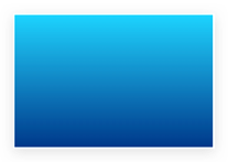
线性渐变
1
2
3
4
5
6
| background-image: linear-gradient(
渐变方向,
颜色1 终点位置,
颜色2 终点位置,
......
);
|
取值:
1
2
3
4
5
| background-image: linear-gradient(
to right,
rgba(255, 255, 255, 0.3),
#f86442
);
|
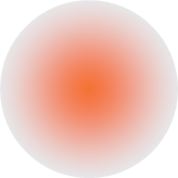
径向渐变
1
2
3
4
5
6
| background-image: radial-gradient(
半径 at 圆心位置,
颜色1 终点位置,
颜色2 终点位置,
......
);
|
取值:
- 半径可以是2条,则为椭圆
- 圆心位置取值:像素单位数值 / 百分比 / 方位名词
1
2
3
4
5
| background-image: radial-gradient(
50px at 10px 10px,
rgba(255, 255, 255, 0.5),
transparent
);
|
06-综合案例-轮播图
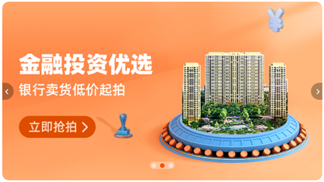
图片效果
HTML结构
1
2
3
4
5
6
7
8
| <div class="banner">
<ul>
<li><a href="#"><img src="./images/banner1.jpg" alt=""></a></li>
<li><a href="#"><img src="./images/banner2.jpg" alt=""></a></li>
<li><a href="#"><img src="./images/banner3.jpg" alt=""></a></li>
</ul>
</div>
|
CSS样式
1
2
3
4
5
6
7
8
9
10
11
12
13
14
15
16
17
18
19
20
21
22
23
24
25
26
27
28
29
| * {
margin: 0;
padding: 0;
box-sizing: border-box;
}
li {
list-style: none;
}
.banner {
position: relative;
margin: 100px auto;
width: 564px;
height: 315px;
overflow: hidden;
}
.banner img {
width: 564px;
border-radius: 12px;
vertical-align: middle;
}
.banner ul {
display: flex;
}
|
箭头
HTML结构
1
2
3
4
5
6
7
8
9
|
<a href="#" class="prev">
<i class="iconfont icon-zuoce"></i>
</a>
<a href="#" class="next">
<i class="iconfont icon-youce"></i>
</a>
|
CSS样式
1
2
3
4
5
6
7
8
9
10
11
12
13
14
15
16
17
18
19
20
21
22
23
24
25
26
27
28
29
30
31
32
33
34
|
.banner .prev,
.banner .next {
display: none;
position: absolute;
top: 50%;
transform: translateY(-50%);
width: 20px;
height: 30px;
background-color: rgba(0,0,0, 0.3);
text-decoration: none;
color: #fff;
line-height: 30px;
}
.banner:hover .prev,
.banner:hover .next {
display: block;
}
.banner .prev {
left: 0;
border-radius: 0 15px 15px 0;
}
.banner .next {
right: 0;
border-radius: 15px 0 0 15px;
text-align: center;
}
|
圆点
HTML结构
1
2
3
4
5
6
|
<ol>
<li></li>
<li class="active"></li>
<li></li>
</ol>
|
CSS样式
1
2
3
4
5
6
7
8
9
10
11
12
13
14
15
16
17
18
19
20
21
22
23
24
25
26
27
|
.banner ol {
position: absolute;
bottom: 20px;
left: 50%;
transform: translateX(-50%);
height: 13px;
background-color: rgba(255,255,255,0.3);
display: flex;
border-radius: 10px;
}
.banner ol li {
margin: 3px;
width: 8px;
height: 8px;
background-color: #fff;
border-radius: 50%;
cursor: pointer;
}
.banner ol .active {
background-color: #ff5000;
}
|


